
Highlights:
- Apple has introduced a new design style called Liquid Glass for its devices.
- Liquid Glass is clear and changes based on what’s around it, giving screens a fresh and modern look.
- The new style appears on iPhones, iPads, Macs, Apple Watches, and Apple TVs.
- Some users say the new design looks nice but may take time to get used to.
- App makers can now update their apps to match this new style.
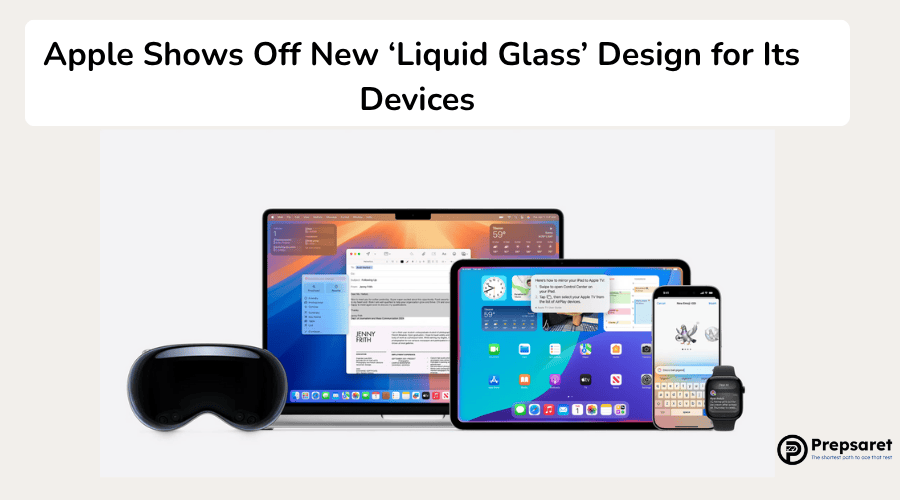
Apple introduced a striking new visual language called Liquid Glass at its annual WWDC 2025 event, marking what it describes as the most expansive software design update in its history. The new material, which dynamically refracts and reflects its surroundings, will appear across iOS 26, iPadOS 26, macOS Tahoe 26, watchOS 26, and tvOS 26, offering a unified yet platform-specific experience.
Apple’s New Look and Feel Across Devices
According to Apple’s vice president of Human Interface Design, Alan Dye, the Liquid Glass design was meticulously developed to integrate hardware and software in a more expressive and visually harmonious way. “It combines the optical qualities of glass with a fluidity only Apple can achieve,” Dye noted in a statement.
The material adapts intelligently to light and dark environments, adjusting its appearance based on surrounding content.
This aesthetic upgrade reshapes everyday interactions, from buttons and tab bars to sidebars and system controls.
For example, in iOS 26, tab bars shrink as users scroll to highlight content, then gracefully expand when needed. On macOS Tahoe 26, the Dock, app icons, and transparent menu bars aim to give desktops a cleaner, more immersive feel.
Early Impressions: Beauty with a Learning Curve
Initial reactions to the new design have been mixed. Writing for The Verge, one reviewer acknowledged Apple’s signature polish but suggested the changes might feel abrupt at first. “I don’t hate it,” the reviewer remarked, “but it needs a little more time in the kiln.”
The reviewer noted that while elements like app icons and magnifiers now float translucently above wallpapers and text, the visual shift could be jarring for some users.
Tools for Developers and What’s Next
To support the transition, Apple has updated its SwiftUI, UIKit, and AppKit APIs, making it easier for developers to incorporate the new design. As the Liquid Glass interface moves from beta to public release, both designers and users will have time to adapt to this bold new aesthetic direction.
Also in the News: